
animation 動畫animation 是動畫,而 transition 是過渡,它們用法很相似,但實際又不大相同,可以說 animation 是 transition 的升級版,它可以創建一個持續的自動執行動畫。 1. 官方定義animation 屬性是一個簡寫屬性,它是下面屬性的縮寫: animation-name 注意:請始終規定 animation-duration 屬性,否則時長為 0,就不會播放動畫了。 2. 解釋animation 是幾個屬性值的縮寫,我們定義一個動畫通常使用 animation 就足夠了,如果想單獨改變動畫的某些屬性可以使用單獨的動畫屬性去改變,構成一個動畫的最基本屬性需要 一個@keyframes 和 duration。 3. 語法.demo{
animation: name duration timing-function delay iteration-count direction;
}屬性值說明:
animation-direction 參數值詳解:
animation-fill-mode 參數值詳解
4. 兼容性
5. 實例
@keyframes go{
from{
width:px;
}
to{
width:px
}
}
.demo{
width:px;
height:px;
background: #000;
animation:go s ;
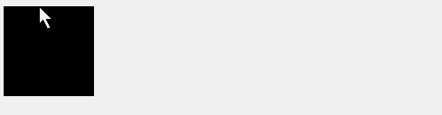
}效果圖
說明:這是最簡單的動畫創建方式,使用 @keyframes 命名一個叫做 go 的動畫,再為這個動畫加上一個 2s 的持續時間 ,構成了最簡單的動畫,但是它只播放一次。
@keyframes go{
from{
width:px;
}
to{
width:px
}
}
.demo{
width:px;
height:px;
background: #000;
animation:go s ease-in;/*這里增加了動畫函數*/
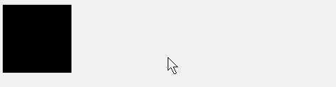
}效果圖
說明:通過在 animation 增加第 3 個參數 animation-timing-function 動畫函數,它可以改變動畫運動的速度曲線。
@keyframes go{
from{
width:px;
}
to{
width:px
}
}
.demo{
width:px;
height:px;
background: #000;
animation:go s ease-in s;/*這里增加了動畫延遲時間 3 秒*/
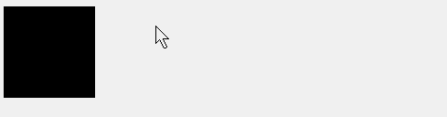
}效果圖
說明:動畫延遲了 3 秒開始再次執行了。
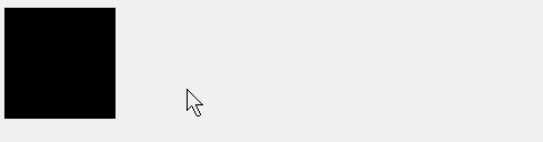
動畫延遲 3s 開始播放,播放 2 次結束。 @keyframes go{
from{
width:px;
}
to{
width:px
}
}
.demo{
width:px;
height:px;
background: #000;
animation:go s ease-in s ;/*播放 2 次結束*/
}效果圖
說明:通過效果圖可以很清楚的看到了動畫反復執行了 2 次,值得注意的這個 3s 的延遲只針對第一次動畫開始前,在動畫開始之后重復循環的時候就不再起作用了。 動畫延遲 3s 開始播放,然后無限循環。 @keyframes go{
from{
width:px;
}
to{
width:px
}
}
.demo{
width:px;
height:px;
background: #000;
animation:go s ease-in s infinite;/*無限次循環*/
}效果圖
說明:通過 infinite 動畫在經過 3s 的延遲之后開始無限的循環了。
延續上面的例子,我們發現動畫每次循環都是從開始的位置開始循環的,下面通過添加 animation-direction 來改變動畫在循環過程中是否反向。 @keyframes go{
from{
width:px;
}
to{
width:px
}
}
.demo{
width:px;
height:px;
background: #000;
animation:go s ease-in s infinite reverse;/*動畫反向播放*/
}使用 alternate 屬性,讓動畫在奇數時候正向播放,偶數時候反向播放。 @keyframes go{
from{
width:px;
}
to{
width:px
}
}
.demo{
width:px;
height:px;
background: #000;
animation:go s ease-in s infinite alternate;
}效果圖
<!DOCTYPE html>
<html lang="en">
<head>
    <Meta charset="UTF-8">
    <Meta name="viewport" content="width=device-width, initial-scale=1.0">
    <title>Document</title>
    <style>
        @keyframes go{
            from{
                width:px;
            }
            to{
                width:px
            }
        }
        .demo{
            width:px;
            height:px;
            background: #000;
            animation:go s ease-in s infinite;/*動畫反向播放*/
        }
        .demo-1{
            width:px;
            height:px;
            background: #000;
            animation:go s ease-in s infinite reverse;/*動畫反向播放*/
        }
        .demo-2{
            width:px;
            height:px;
            background: #000;
            animation:go s ease-in s infinite alternate;/*動畫偶數反向播放*/
        }
    </style>
</head>
<body>
    <h2>正常播放順序</h2>
    <div class="demo"></div>
    <h2>反向播放順序</h2>
    <div class="demo-1"></div>
    <h2>奇數正向播放偶數次反向播放</h2>
    <div class="demo-2"></div>
</body>
</html>
單次動畫使用 forwards 設置動畫結束之后使用結束后的狀態作為樣式。 @keyframes go{
from{
width:px;
}
to{
width:px
}
}
.demo{
width:px;
height:px;
background: #000;
animation:go s ease-in s forwards;
}在設置延遲之后元素中使用 backwards 設置動畫的開始的樣式。 @keyframes go{
from{
width:px;
}
to{
width:px
}
}
.demo{
width:px;
height:px;
background: #000;
animation:go s ease-in s backwards;
}效果圖
<!DOCTYPE html>
<html lang="en">
<head>
    <Meta charset="UTF-8">
    <Meta name="viewport" content="width=device-width, initial-scale=1.0">
    <title>Document</title>
    <style>
        @keyframes go{
            from{
                width:px;
            }
            to{
                width:px
            }
        }
        .demo{
            width:px;
            height:px;
            background: #000;
            animation:go s ease-in s ;/*動畫反向播放*/
        }

        .demo-1{
            width:px;
            height:px;
            background: #000;
            animation:go s ease-in s  forwards;
        }
        .demo-2{
            width:px;
            height:px;
            background: #000;
            animation:go s ease-in s  backwards;
        }
    </style>
</head>
<body>
    <h2>正常動畫</h2>
    <div class="demo"></div>
    <h2>設置 forwards</h2>
    <div class="demo-1"></div>
    <h2>設置 backwards 注意觀察開始</h2>
    <div class="demo-2"></div>
</body>
</html>
說明:在鼠標刷新瀏覽器我們看到本應該 100px 寬度的元素是以 200px 開始的,當動畫結束之后,回到了 100px。 both 在設置動畫延遲情況下,元素使用開始的狀態,并在整個動畫結束之后使用結束之后的狀態。 @keyframes go{
from{
width:px;
}
to{
width:px
}
}
.demo{
width:px;
height:px;
background: #000;
animation:go s ease-in s both;
}效果圖
<!DOCTYPE html>
<html lang="en">
<head>
<Meta charset="UTF-8">
<Meta name="viewport" content="width=device-width, initial-scale=1.0">
<title>Document</title>
<style>
@keyframes go{
from{
width:px;
}
to{
width:px
}
}
.demo{
width:px;
height:px;
background: #000;
animation:go s ease-in s ;/*動畫反向播放*/
}
.demo-3{
width:px;
height:px;
background: #000;
animation:go s ease-in s both;
}
</style>
</head>
<body>
<h2>正常動畫</h2>
<div class="demo"></div>
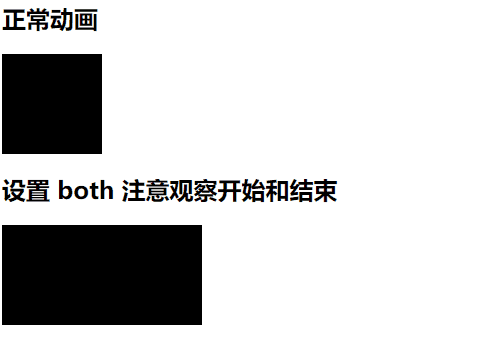
<h2>設置 both 注意觀察開始和結束</h2>
<div class="demo-3"></div>
</body>
</html>6. 經驗分享
<div class="demo">
    往事不要再提<span>人生已多風雨</span>
</div>
.demo{
cursor: pointer;
}
.demo>span{
display: none;
}
.demo:hover>span{
display: block;
animation: shows s forwards;
}
@keyframes shows {
from{
opacity: ;
}to{
opacity: ;
}
}效果圖
說明: transition 不能實現(隱藏/顯示)之間的過渡效,原因是 diaplay:none 設置之后雖然元素在頁面中,但是這個標簽不在瀏覽器的渲染進程里面。如果這個元素屬性為 display:block 相當于元素從新渲染出來,這時里面的 opacity: 0 到 1 就不起作用了。所以這里使用 animation 正好可以彌補這個問題。 7. 小結
|